As we continue to smash through the backlog of chart feature requests, we recently shipped a big-ticket feature in relative valuation charts. I wanted to share some insight into that release, as well as highlight a couple of other projects I worked on that are small improvements to existing features.
1) Relative Valuation Charts
Relative charting has existed on Koyfin for years. Relative Ratio (A/B) is the ratio of two prices and is rebalanced daily. Relative Performance (A% - B%) is the performance spread of two assets and assumes an investor is long one dollar of A vs short one dollar of B at the start of the chart period with no rebalancing. Relative Spread (A - B) is simply the difference between A and B and is particularly useful for yields.
A workflow that has been missing from this family of relative data series is relative valuation. Relative Valuation (Multiple A / Multiple B) is like the relative ratio (A/B) but for valuation multiples. It allows an investor to quickly establish where a security’s valuation stands in relation to another asset, sector, industry, or another grouping of securities.
Suppose you wanted to see how Lululemon’s forward PE compares to the Consumer Discretionary sector. The relative PE series shows that Lululemon has historically traded at a premium to the sector, until mid-2024 (indicated by the fact the ratio dropped below 1.0).
Both Lululemon and the sectoral ETF have seen multiple compression over the last 12 months, but the magnitude of decline at Lululemon has been larger than the sector as a whole. Notice how the PE of XLY (consumer discretionary ETF, blue line) overlaps Lululemon’s PE (light purple line) in 2024.
The chart below shows Apple’s PE relative to the S&P 500 (blue line) in the upper panel and the PE of Apple (black line) and the S&P 500 (orange line) in the bottom panel. The thick, vertical, black line in 2019 indicates the period when Apple’s PE began to exceed that of the S&P. Above, you will note that the relative ratio surpasses 1.0 at this period too.
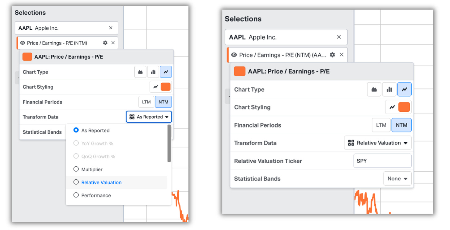
This data series is created differently from other relative series; which exist in the data series picker as individual items. Relative valuation exists in the indicator settings panel as a transformation option (similar to how we designed the Multiplier data series).
Because this was created as a transformation series, it means that the ability to apply statistical bands (means, standard deviations, lows, highs, etc) is included too.
This transformation is now present under all of Koyfin’s valuation data series and is available across the global library of equities, as well as US ETFs.
2) Fibonacci Customisation
Fibonacci annotations in Koyfin have existed in some form for years. However, it lacked the level of functionality that would satisfy the needs of an investor who uses this workflow. No extension lines and no level customisation. Just standard retracements. It was a bit like offering someone a car that drives, but only in first gear. It can get you to where you need to go, but serious drivers need more control and speed to enjoy the experience. With all that said, I dived into our feature request backlog and aggregated the feedback specific to Fibonacci.
Parsing through the requests revealed that folks wanted; (1) a retracement trend line, (2) extension lines, (3) the ability to show/hide levels, (4) the ability to customise levels via user inputs and, (5) some colour formatting.
The initial wireframes sought to bolt most of this additional functionality onto the pre-existing annotation settings window (from line type to delete). The new ‘values’ window would include checkboxes to show and hide levels, numerical boxes for customising levels, a colour picker for individual lines, and a reset button in case things needed to be turned back to factory settings.
What we ended up with was a lot more elegant than my wireframes, but captured the spirit of what we wanted to achieve, and then some. While there are still more improvements we have yet to make to Fibonacci, I believe this update made the annotation truly usable for a point-in-time analysis.
3) CAGR for % Change Annotations
Small design or function improvements can feel like thankless tasks. They are too small to warrant mass communication and generally get pushed to production without so much as a whisper; sneaking in and waiting patiently to be discovered. We ship so many of these it would be redundant to cover them all, but one that I enjoyed recently is the addition of a CAGR and period to our % Change annotation.
This one is particularly useful when dealing with fundamental data series, like in the above example where I plot Alphabet’s 20Y free cash flow CAGR. In many instances, these CAGRs exist as separate data series, but the ease of just attaching an annotation instead is nice too.
Thanks for reading,
Conor


👍
The CAGR feature was an early a Christmas present! Appreciate it!