Peter Lynch Charts
Plus: Volume Profiles, VWAPs, Shareable Screens, and Price Transformations
As some of you know, I am a product manager at Koyfin. This means I get to play a hand in designing the features that we introduce to the terminal. This is fulfilling to me on many levels. Firstly, as a user of Koyfin’s terminal for years, it means that (sometimes) I get to work on features that I really want as a user. Secondly, there is a deep satisfaction in taking a feature that users have been requesting and giving it to them. And lastly, I get to spend every day doing work that I am passionate about and that helps me grow.
Every time we ideate a new feature, a lot of thought and comprehension go into that. To ensure that we understand what we are building and that we communicate its value and purpose to engineers and, ultimately, users. A byproduct of this process is that I constantly learn new subject matter and strengthen my understanding of things I knew a little about already.
I am going to start occasionally documenting some of the work I do in that part of my life (like this post in April) and share it in a new section called Product Work. This way, you can unsubscribe from that section if you are not interested in that type of content. Without further ado, here are a few things I worked on that we shipped in the last week or so as we looked through our backlog of feature requests for charts.
1) Peter Lynch Charts
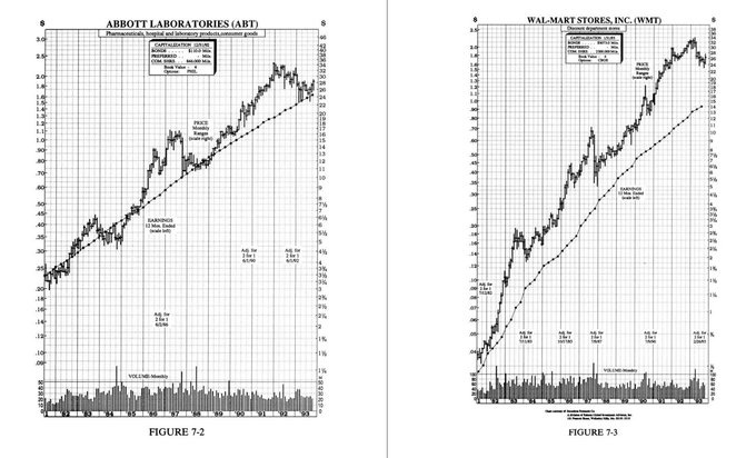
In several of Peter Lynch's old books, he shared a charting technique later dubbed the Peter Lynch Chart. "A quick way to tell if a stock is overpriced is to compare the price line to the earnings line", he commented in One Up on Wall Street. Lynch was watching to see when the share price made contact with that earnings line.
“If you bought familiar growth companies – such as Shoney’s, The Limited, or Marriott – when the stock price fell well below the earnings line, and sold them when the stock price rose dramatically above it, the chances are you’d do pretty well”.
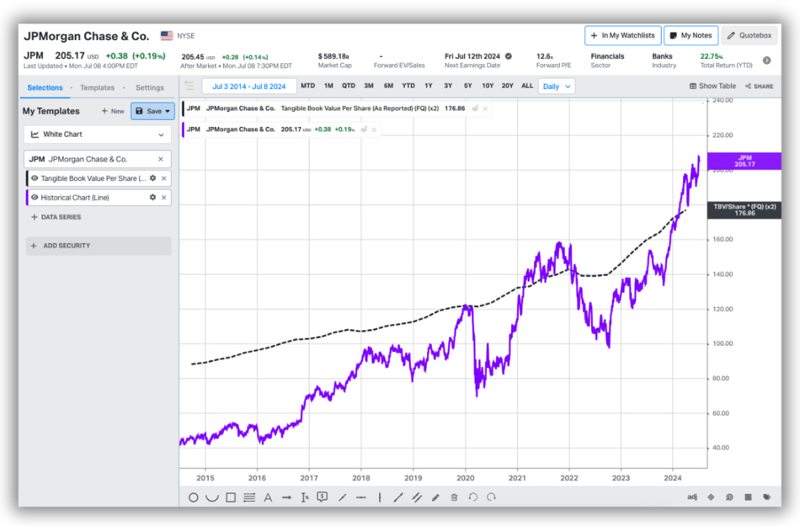
Another variation of this workflow is something that investors refer to as Fair Value Bands. Suppose you believe that when JP Morgan trades at 2x total book value, it’s fair value. You want to plot that price level on a chart, like below.
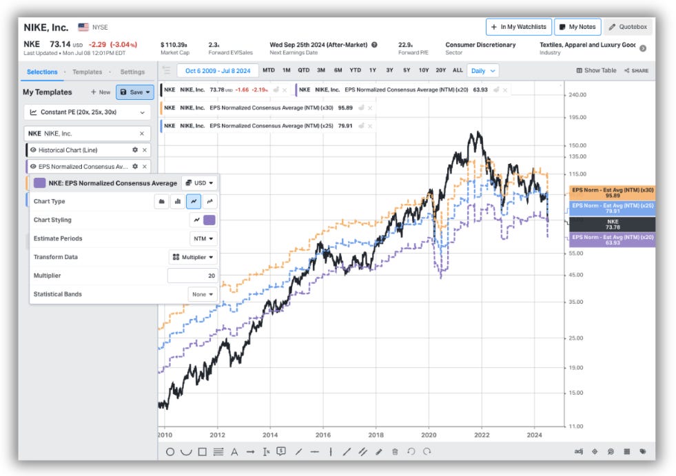
We recreated this workflow by allowing users to multiply or divide data series. In doing so, someone can take the underlying data series in a multiple, such as revenue per share or consensus average NTM EPS and create constant multiples. The result is a time series which replicates the share price as though it were pinned at a constant multiple. Suppose Nike trades at 23x earnings and you want to see how that compares to historic averages.
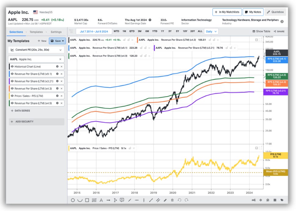
You could open up a chart and display the PE in addition to some statistical bands such as mean to show the average over a period. Alternatively, you can now plot a sequence of constant multiples to see how often Nike trades in that value range. To highlight another example, Apple currently trades at ~9.1x trailing revenue and has averaged 4.3x over the last two decades and 4.9x over the last decade. The S&P 500 currently trades at ~3.1x revenue. Here’s what that would look like with each of those four bands plotted relative to Apple’s share price over time.
As illustrated, Apple’s price to sales has reached unprecedented levels in recent years. I am confident people will find other ingenious ways to use this feature that we didn’t consider. Whatever the nomenclature, this feature was the case of us taking some initiative to build something we thought would create a new and unique workflow for users. The number of explicit requests for this functionality was lower, relative to some of the other things I’ll discuss today. But sometimes you have to build things that are just plain awesome.
2) Shareable Screeners
At Koyfin, we’ve been thinking a lot about collaborative work and shareable assets. There are many tangents in this lattice of potential use cases. For one, how individuals share vs how teams share can be distinctly different. Sometimes the sharing flow depends on the asset. When sharing a chart template, it’s most often the case that you want to share a copy of that chart so that the recipient can have one of their own. In essence, every recipient gets their own replica. It’s like a scanned document.
In a Watchlist this duplication is desired. But there is also a demand for collaborative work inside of the same asset. For instance, Dave invites Jenny to Watchlist 1, where they build tables and views and can see each other’s changes in real-time. In another instance, the owner of the Watchlist may wish to share the live changes of the Watchlist but not grant viewers edit rights.
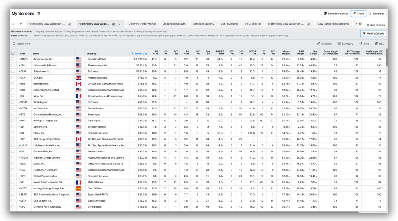
With screeners, we opted to go down the path most similar to the chart template. The core value in sharing a screener is the inputs; the selection of criteria the user has used to generate the results. Users can now enable public access to their screener which allows a recipient to (a) view the screener output with read-only rights and (b) save a copy of the screener and its inputs to their terminal if they wish to edit it.
The cool thing about this sharing flow, enabled by a URL, is that the screener can be viewed by anyone; regardless of whether or not they have a Koyfin account. If you’d like to check it out, check out this screener I created which scans for profitable companies trading at historically low valuations with moderately high margins relative to their history.
3) Volume by Price Profile
I enjoy assembling fundamental and economic charts, but I have never been much of a technical analyst. Nonetheless, I enjoy opportunities to learn more about these kinds of indicators and data series, and we had a backlog of feature requests relating to some essential technical indicators that we wanted to make disappear.
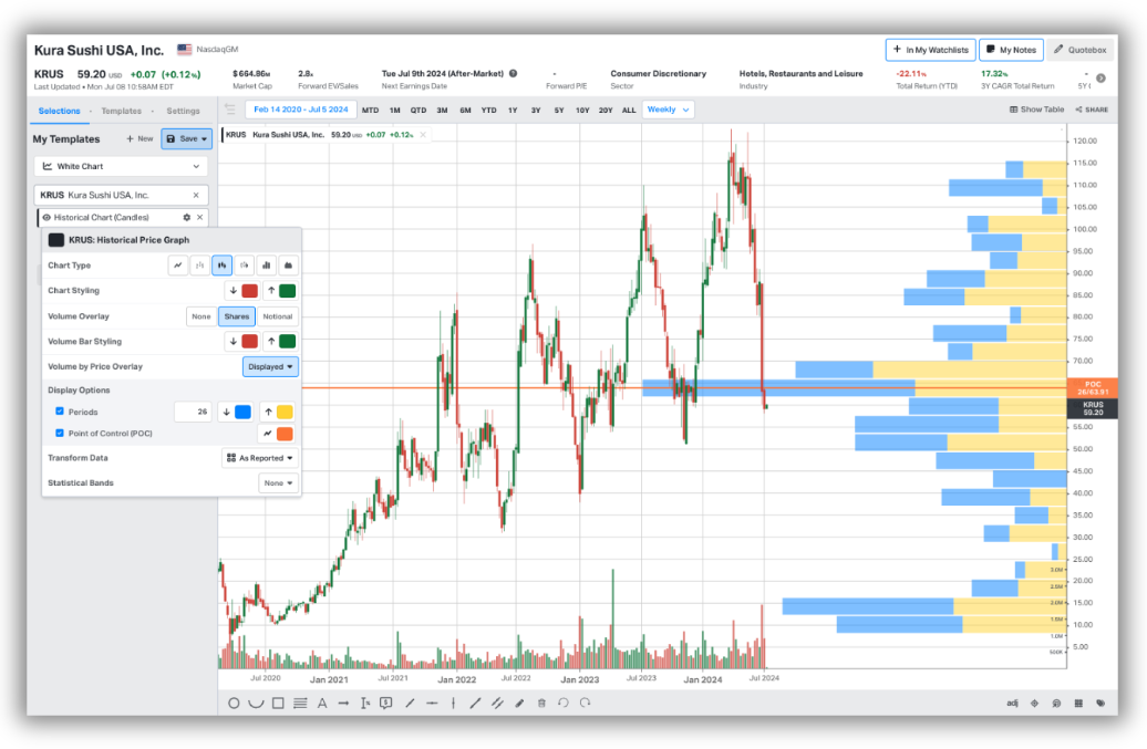
The Volume by Price profile is an overlay, usually pinned to a y-axis, that displays the total volume traded at a range of equally distributed price ranges over a specific period. It was a fun challenge, and after ensuring I could reproduce a few in Excel, the underlying maths and logic were easy enough to grasp.
Price intervals on the y-axis will be updated according to the time period selected on the chart, as well as the user’s preference for the number of periods (bars) they wish to show. The Point of Control (POC) line, which indicates the period with the highest traded volume, can be toggled on/off. The calculation will adjust when the user toggles between displaying adjusted vs unadjusted prices too.
4) Anchored VWAP
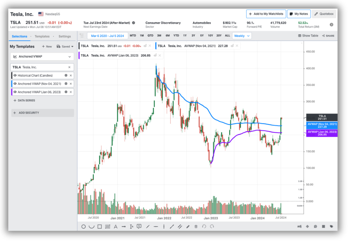
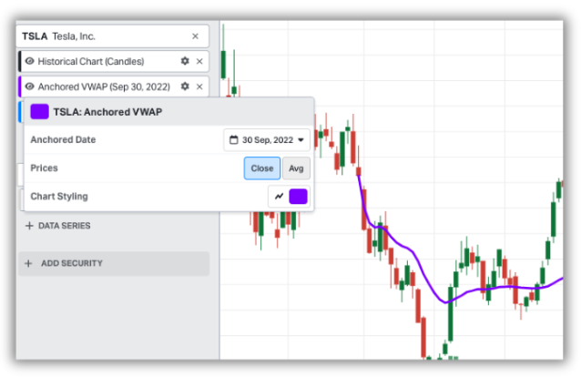
A technical indicator I had never heard of before until this year, but one that had a considerable number of upvotes on our feature request board. A VWAP (Volume Weighted Average Price) indicator calculates the average price of a security based on volume and price within a specified time frame. The regular VWAP typically begins at the start of the specified period. The anchored VWAP is just a VWAP where you can specify the start date (the anchor). They are used by technicians to identify trends, support and resistance, entry and exit points, sentiment, and so forth.
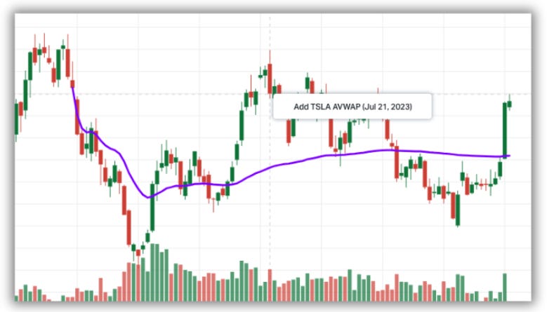
The math for this one was, again, relatively simple. However, it was an interesting feature because of the UX of applying the VWAP to a chart. There are a few components you’d want to specify; the anchor date and calculation method. While it’s not an annotation tool, we figured it would be nice to allow a user to click on the candle to specify a start date, but at the same time change the date if they wanted to. We settled on a hybrid of solutions. First, we enabled AVWAPs to be added using a right-click on the chart screen when hovering over a candle. This is the first time we are experimenting with this type of flow.
Doing so will populate the AVWAP as a data series in the left side panel under that security, where you can change the anchor date, prices used in the calculation, and chart stylings.
Alternatively, you can bypass the right-click and simply add VWAPs to the chart by using the side panel data series picker.
5) Historical Price Transformations
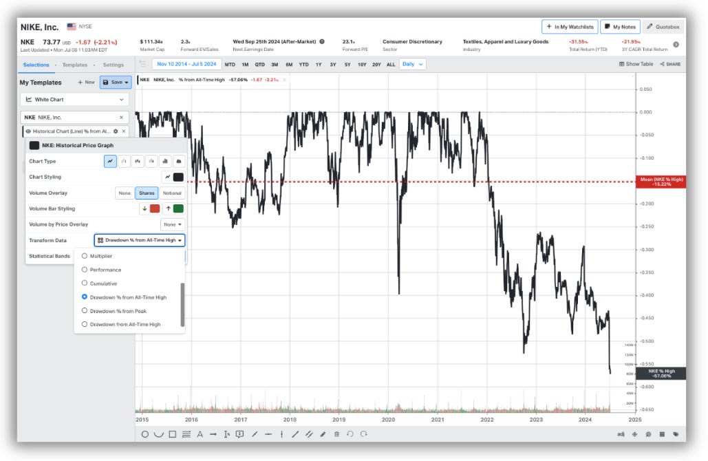
This update, which allows a user to transform the historic price of a security, was mostly a matter of UX and improving the visibility of functionality which already exists. Previously, a user would have to search for a secondary data series to display performance, drawdowns, YoY % and QoQ % change, YoY and QoQ change and cumulative change.
Possible, but perhaps not the most intuitive. For example, to display the drawdown history of Nike, a user would be required to first add Nike to the chart, and then search for a second data series called “Drawdown from peak”. Now, the user can transform the original Nike price chart there and then. This also enables users to add statistical bands to these transformations to show means, medians, highs, lows, and percentiles over a time series.
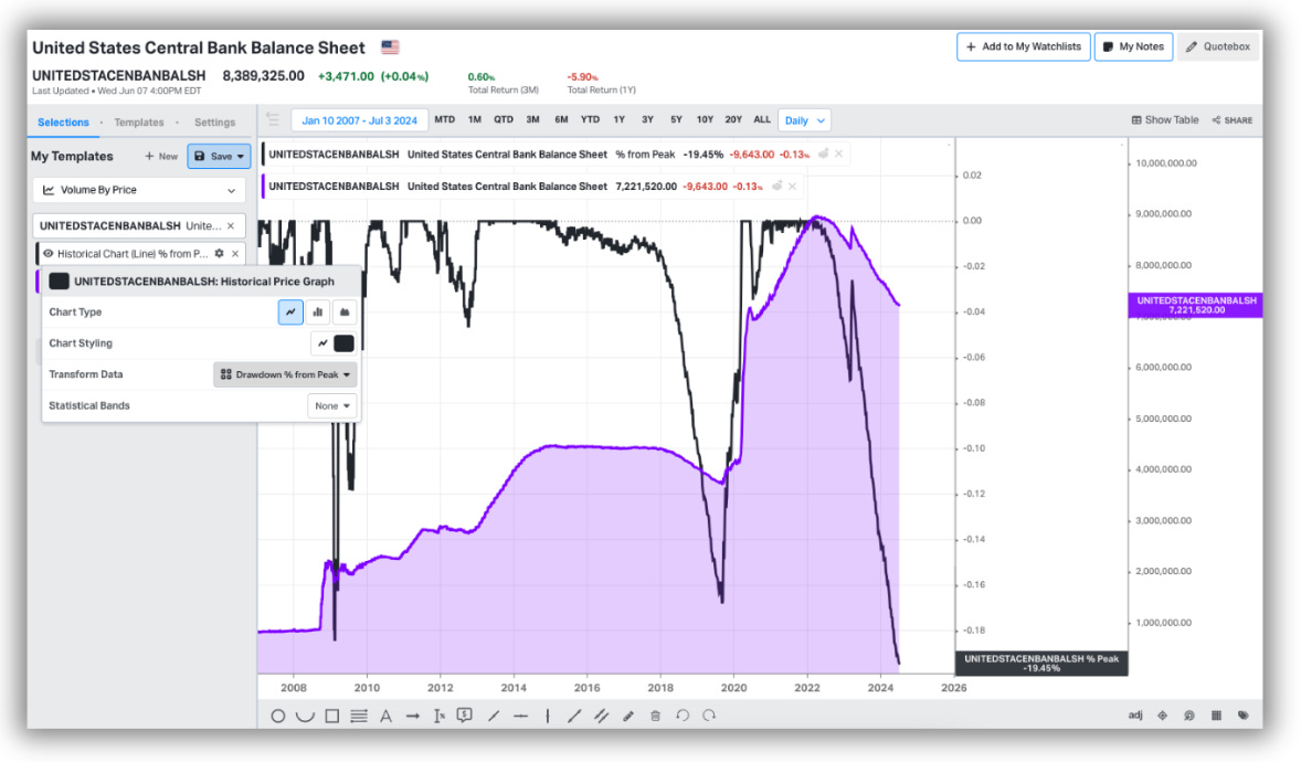
This is particularly useful for macroeconomic data series which are presented in notional terms. The Federal Reserve Balance sheet, for example. To quickly illustrate how far it has fallen from its peak now takes a couple of clicks. One of Koyfin’s advantages is that we pack an incredible amount of functionality into a modern UI. However, this also means that it can be difficult to realise the full extent of capabilities at your fingertips. With subtle improvements like these, we hope to alleviate some of that.
Thanks for reading,
Conor


Conor - has Koyfin done any work analyzing the effectiveness of these strategies on profit performance? I know you’re in the business of selling the “picks and shovels” but it would be helpful given the data and tool availability to provide a perspective of what’s working generally rather than individually.
Interesting and exciting work, Conor. Two follow-on comments...
01. Peter (along with many institutional investors) relied on the long-gone MC Horsey charts for what you call the "Peter Lynch chart." It was one 'secret' that was actively shared. Bill O'Neill used the Horsey charts as the template for his weekly Datagraphs books, also now long-gone.
02. Institutional (and other professional) investors today, and for the past several years, use VWAP (and Anchored VWAP) wholly differently than retail investors. You can see it in real time every session ~10 minutes prior to the [NY markets] regular session's close, at which time price gives ground, in the opposite direction to that day's trend, to accommodate the surge in VWAP order flow.
Thank you for another excellent post.