PepsiCo Paid $1 Million for This
The Absurdity of Design
One million US Dollars is a lot of money. In the United States, one of the world’s most affluent nations, the typical average salary is somewhere in the mid $50,000s per year. In my home country, the UK, it’s considerably worse, clocking in at ~£38,000. In those terms, you can see how a million dollars feels like a lot. I created this cool chart to illustrate it.
But when you hear that PepsiCo, the parent of the Pepsi-Cola brand, paid $1 million for the logo you see below, it doesn’t sound like much considering this business generated revenues just shy of $80 billion in 2021 with $11.8 billion of that flowing through to operating income (I created another cool chart to illustrate the contrast).
In this context, one million Dollars seems reasonable. This is a gargantuan business, touching every corner of the planet, and serving millions of customers on a daily basis. What's more, they don’t change their logo all too often; it’s not like they are a football team that unveils a new kit with each season. Since the early 90s, Pepsi’s logo has changed hands just six times. It’s such a global brand, they can’t let just anyone redesign the face of it.
Okay, but what does $1 million get you?
Today I wanted to share the relative absurdity of how this new logo design came to fruition. Before we continue, just familiarise yourself with the 2006 to 2008 version. In pitching the design which is still used to this day in 2008 (albeit, with a slight update in 2014 with some boldening of letters), the Arnell Group (American designers) drafted a report titled “Breathtaking Design Strategy”. Within this strategy document, are some of the most convoluted and contorted rationalisations I have ever seen. Perhaps it’s a byproduct of my design ignorance but I found it to be quite funny. Remember that we are talking about something that will be stuck on the side of an aluminium can here. For all intents and purposes, it’s a circle, with three segments inside of it.
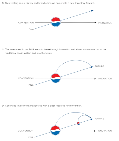
It kicks off with a pretty simple question; “how do we move from convention to innovation?”.
Then it shows a series of alternative timelines that conjure the idea that Pepsi’s new logo must continue to possess the Pepsi DNA (a term they use a lot) and shift paradigms; jumping off the innovation curve and landing right into the “future”. Okay, I can get down with that. Times change, and you have to adapt.
Then on the next slide, they pull out the Mona Lisa and I lost it (but it gets so much worse). They say; “true innovation always begins by investigating the historic path” and that “going back to the roots moves the brand forward as it changes the trajectory of the future”.
Okay, how far back?
Arnell: Oh, like 3,000 BC?
The timescale begins in that year, with the Hindu tradition of numerical harmony as a spatial organiser. It migrates through to early 600 BC, when the proportions of a circle were studied. Followed by the Golden ratio 300 years later, the Mona Lisa, Da Vinci’s Vitruvian man, and lastly, in 2009… Pepsi’s “Breathtaking Strategy”. What a lineup. I am certain that 3,000 years from today Pepsi’s logo will be remembered in the same vein as the rest of these contemporary breakthroughs.
Following that, they talk about the geometry of the vessels that the beverage has been carried in over the last 200 years; from a moonshine jug to a glass bottle, to the classic plastic. After that, they spend nine pages “tracing the DNA of Pepsi”. Like, literally, just tracing the logos of the past and breaking them down into an assortment of shapes and squiggles.
This one (below) was a personal favourite.
And then it comes back to the Mona Lisa and the fundamental concepts that have underpinned some of the world’s finest artistic and architectural wonders, many of which proportion their work to approximate the Golden Ratio; which in simple English is when a line is divided into two parts and the longer part divided by the smaller part is equal to the sum of both parts divided by the longer part. This equation would result in an output of 1.61803398875 when calculated.
It is believed that this ratio proportions things in such a way that they are perceived as beautiful or aesthetically pleasing. Or as Arnell put it; “the Golden Ratio plays an essential role in human perception of beauty”.
Where is this going?
Yep, you guessed it. The Golden Ratio begins with a humble square, but the Pepsi Ratio begins with a circle. Breakthrough.
Then they start discussing how the emotion of the white segment changes as the perspective of the viewer changes.
And this is the one they end up choosing…
But it gets so much weirder. Because then they start talking about gravity, and the relativity of space and time.
But my favourite part of the report has to be the section where they start mentioning the earth’s geodynamo, magnetic fields and magnetic dynamics alongside the Pepsi logo. They state the earth’s geodynamo is “a naturally occurring electric generator in fluid motion [that] generates and sustains the Earth’s magnetic field” and that “magnetic fields are impacted by sun radiation and wind motion”. Then they show a contorted picture of the logo alongside it like what they are saying relates to it in any way shape or form.
Naturally, the best is saved for last. Universe expansion and Pepsi Orbits. What even is that?
I will drop a link to the report so you can read it yourself, and would love to hear your thoughts. Lastly, before I sign off. This is not intended as a mockery of the incredible thought that goes into marketing and design. These people have insights into the way the human brain functions that are unknown to many. It’s more of a light-hearted commentary on how absurd this appears from an outsider’s perspective. It gave me mental gymnastics meme vibes when I first stumbled upon it.
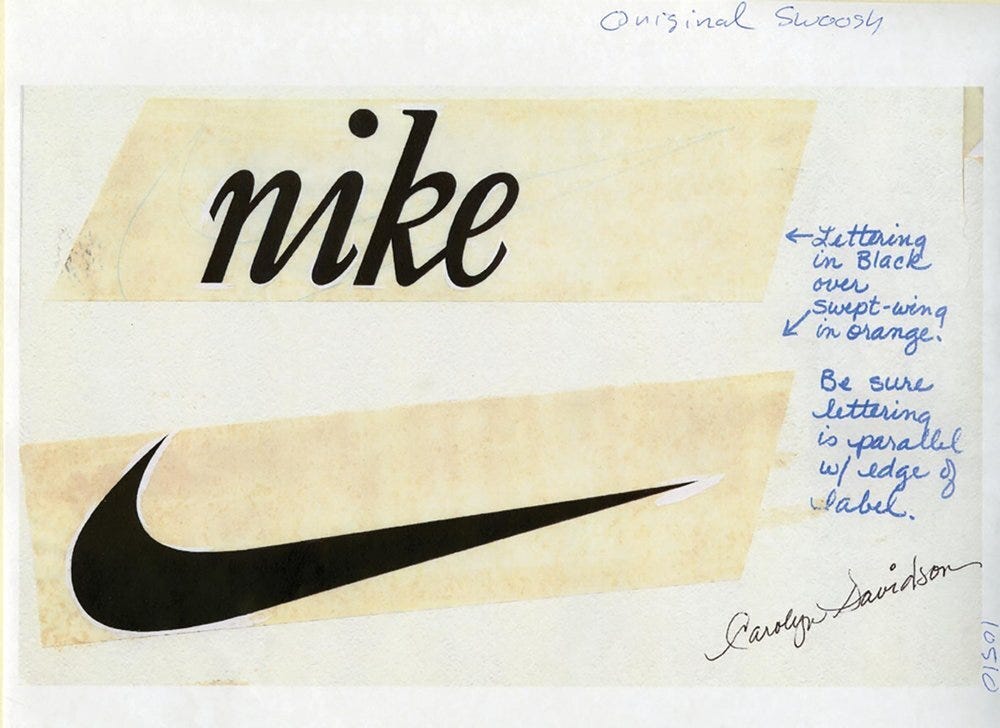
Contrast this with the classic tale of Nike’s logo design, purchased from a design student for $35, Carolyn Davidson, who inked it on a piece of paper, with her hands, and you can maybe see the humour in it. She was later awarded handsome stock grants.
Anyway, thanks for reading.
Conor


Still, a million dollars, this makes me have some misgivings about Pepsi's capital allocation.
How did you stumble across the document in the first place? Seems like a topic that most involved parties would be happy to keep quiet on.