

Every day I pour through the Koyfin feedback forum to respond to users. It’s where the community can leave general feedback, ask questions, and report bugs and issues. By far the busiest forum is feature requests which, through its upvoting system, gives us a good sense of what the people want. Koyfin has over 1,800 active feature requests, and we knocked off a big one this afternoon. Of those thousands of requests, the Yield Curve graph was in the top ten; coming in at eighth place.
A yield curve graph is a way to visualise the relationship between the interest rates (or yields) of bonds with different maturities (tenors). They are typically used for government bonds of maturities between 1 month and 30 years. We also added a 0-month tenor, which is represented by the current central bank policy rate of the respective country. The tenors are commonly displayed along the x-axis while the y-axis is used for the yields.
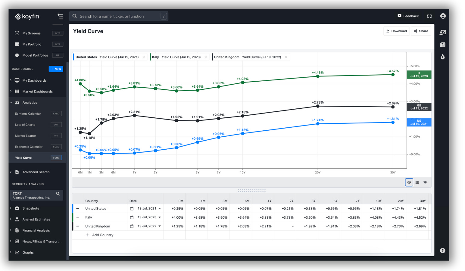
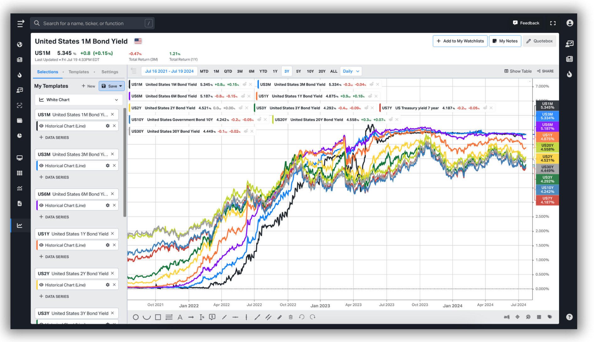
It’s an alternative perspective to viewing government bond yields on a time series. To illustrate, in the chart below, I have plotted a time series of yields for US government bond tenors between 1 month and 30 years. As you see, this can be visually cumbersome to study. We see that yields are going up, but seeing where one tenor trades in comparison to other tenors is difficult.
Now imagine selecting a date along that x-axis and striking a vertical line straight through the chart. That line, for that specific date, will meet a single data point for each government bond tenor. The Yield Curve essentially transposes this data and presents it across an x-axis. It can be used to compare the yield curves of countries, or the historic yield curves of a single country through different environments.
There are several ways to interpret a yield curve. The three most common are those which are ‘normal’, ‘inverted’, and ‘flat’. The normal yield curve is upward-sloping, indicating that longer-term bonds have higher yields than shorter-term bonds. The inverted curve is the opposite, a downward-sloping curve where shorter-term bonds exhibit the highest yields.
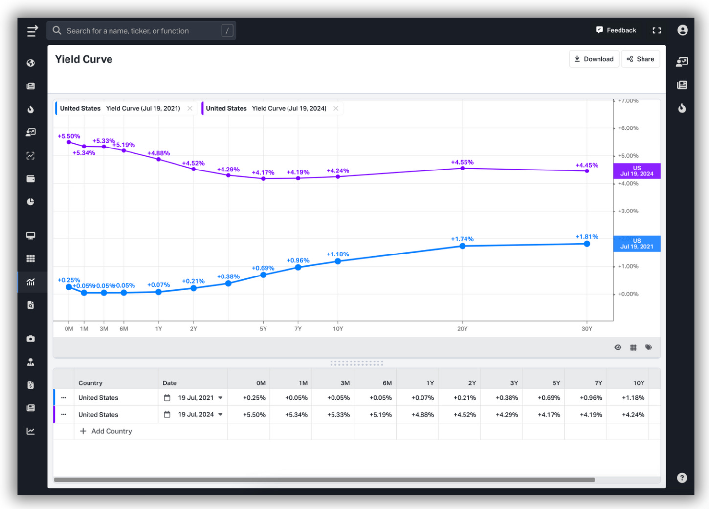
While not always the case, the rule of thumb is that inverted yield curves evoke caution from investors expecting a recessionary environment. Meanwhile, normal curves indicate the expectation of economic growth and rising interest rates. Flat curves, which look as they sound, are commonly seen during transitionary or uncertain periods.
There are other ways to illustrate these relationships. Below is a chart showing the United States 10Y2Y curve.
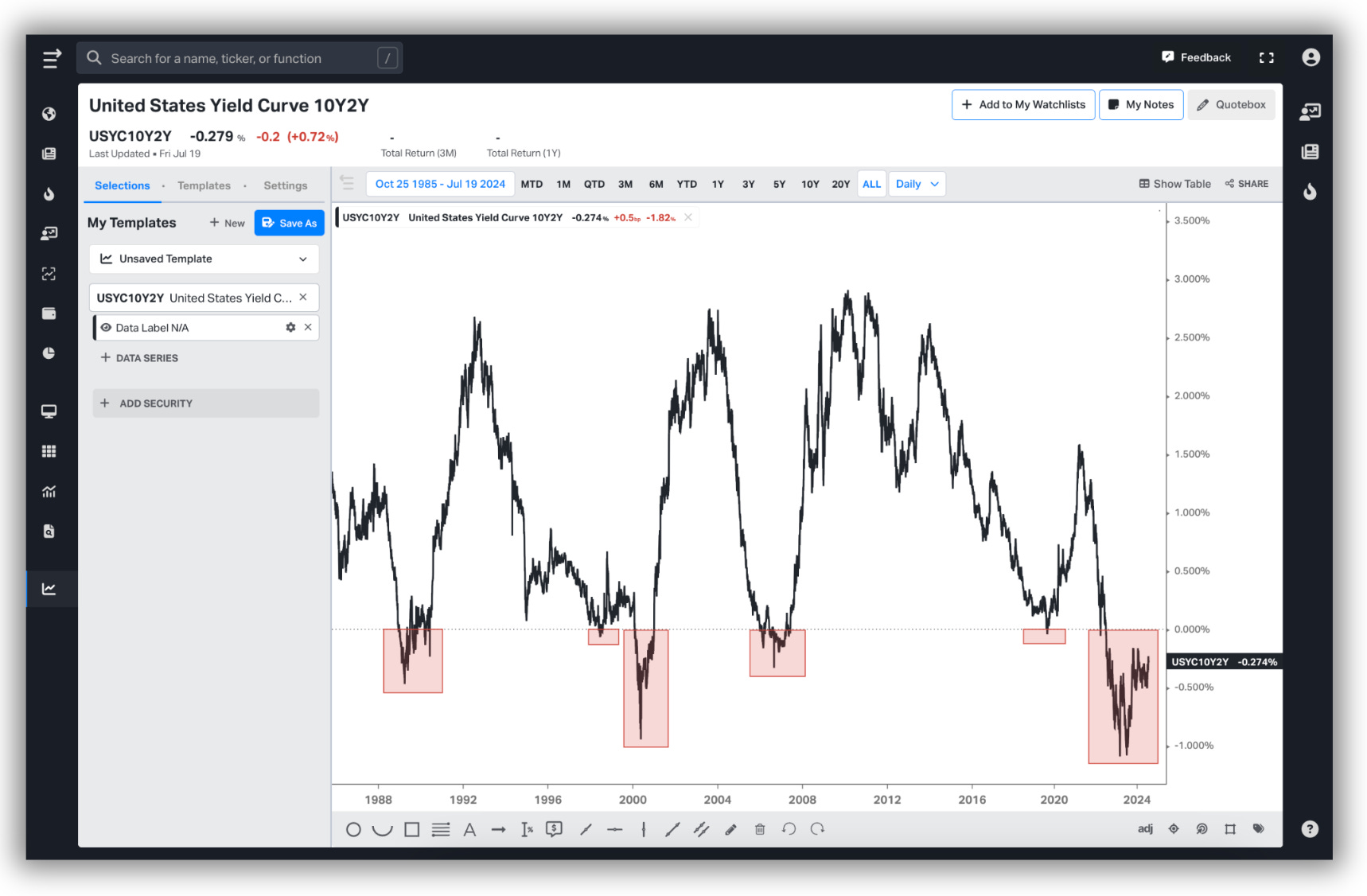
The inversion of this particular curve has had a 100% hit rate for forecasting recessions. This success rate did come into question during the inversion in the summer of 2019, however. Preceding the pandemic by ~8 months, some argue that the recession which followed, as ephemeral as it may have been, was an anomaly. That there was no way a yield curve could have forecast a pandemic; that without the pandemic, we have no way of knowing if a recession would have occurred. That’s just the reality of it, we will never know, and I imagine the 2019 inversion will forever be marked with an asterisk. As for the current inversion, which has been ongoing since the first quarter of 2022 with no recession yet to be unearthed, only time will tell.
I digress. The Yield Curve is a new way of looking at the data we already presented inside of Koyfin. While it sounds simple on the surface, this required building a new page to support this workflow. The chart on which the Yield Curve is positioned looks similar to existing charts in the platform, but besides a similar UI, it’s entirely different.
The make-up of the page itself was another factor to consider. At first, it looked like it should be a new addition to our Market Dashboards section. However, the required UI for such a tool was not consistent with the rest of the dashboards. While it shares the symbiotic relationship between tables and charts, traditional market dashboard tables house fixed data. In other words, the user has a predefined selection of columns. The data, selected by a checkbox in the table, would then appear on the charts. The Yield Curve required date selection, country selection, as well as the ability to duplicate each of these selections at will. With so many possible variations, it wouldn’t make sense to build this inside of a static table.
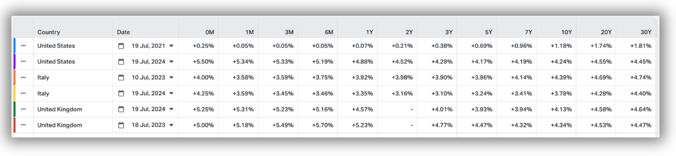
The workflow was more compatible with the Analytics tools we provide, and that is where we put it. The table, which dictates the data presented on the chart, allows a user to select a maximum of ten yield curves at one time, across a combination of countries and dates. It also presents the yield curve in tabular format for the date chosen.
Users can alter the colour, thickness, and style of the chart lines, as well as the rest of the usual alterations. We introduced a show/hide data label for the first time, which accents the data points with labels in one click. This is something I’d like to implement more across the platform. The ability to download the data, as well as share customised PNGs of the chart, is also available.
It just went live in production this afternoon and should prove to be yet another workflow Koyfin users can now perform in-house.
Thanks for reading,
Conor
Can you give us the chart that shows the value of the US Dollar vs the Average Wages per hour or day showing the separation from Pres. Nixon taking the dollar off the gold standard until now, please.
And perhaps the US GDP vs Government debt or Bonds due to be paid in the future, to reveal the alarming difference we must make up to for the US dollar to remain the worlds currency, please.
Much awaited feature! Thks!